Creating dashboards no longer requires coding skills, thanks to modern no code platforms. With drag-and-drop tools, you can design interactive dashboards by simply arranging widgets like charts, KPI tiles, and tables on a grid. These platforms connect to live data sources, making it easy to track metrics in real time. Here’s the process in a nutshell:
- Choose a Platform: Select one of the top no code tools that supports your data sources (e.g., Google Sheets, SQL) and offers essential features like security, customization, and deployment options.
- Prepare Your Data: Clean and organize your data to avoid errors and improve performance. Use aggregated views instead of raw data for faster loading.
- Add Widgets: Drag and drop widgets onto a grid, connect them to data sources, and configure their settings. Stick to clear labels and logical groupings.
- Optimize Layout: Arrange widgets for readability, prioritize key metrics, and test on both desktop and mobile devices.
- Test and Publish: Validate permissions, ensure accuracy, and share your dashboard with appropriate access levels.
These tools make it possible for anyone to visualize data and make informed decisions without relying on technical expertise.
Drag&drop dashboard in JavaScript (Gridstack.js)
sbb-itb-3a330bb
What You Need Before You Start
Before diving in, make sure you have a platform account, clean data, and the necessary access permissions. Most no-code dashboard tools offer either a free trial or a "forever free" plan, so you can test the waters without needing to share your credit card details. You’ll also need active accounts for the tools where your data is stored - like Google Sheets, Airtable, MySQL, or REST APIs - and the appropriate permissions to connect them. If you’re planning to build a gated dashboard, authentication tools like Auth0 or Supabase Auth can help you manage user logins effectively.
Here’s something to consider: more than 70% of executives identify real-time data quality and technology gaps as major hurdles to making decisions. On top of that, around 97% of collected data goes unanalyzed. By organizing your datasets upfront, you can ensure your dashboard delivers meaningful insights rather than adding to the data clutter.
Selecting Your Platform
The platform you choose should align with your project needs - whether it’s data connectivity, UI design, security, or deployment options. Look for platforms that offer pre-built connectors for databases (like SQL or MongoDB), spreadsheets (Google Sheets or Airtable), and APIs (REST or GraphQL). These connectors save you from writing complex integration code. On the UI side, features like drag-and-drop editors, a variety of widgets (charts, tables, gauges), and options to customize colors, logos, and layouts are essential for creating a polished dashboard.
Security is just as important. Make sure the platform supports role-based access control, single sign-on (SSO) or SAML integration, audit logs, and encryption. If your organization has strict data hosting requirements, check whether the platform offers deployment options like cloud, self-hosted, on-premise, or even air-gapped setups.
The Best Low Code & No Code Platforms Directory is a great resource for comparing platforms. You can filter by specific needs, like air-gapped hosting or pricing models. For instance, ToolJet provides free self-hosted plans with no per-end-user fees, while Retool uses a hybrid pricing structure at $10 per builder and $5 per user per month. By 2025, it’s estimated that 70% of new applications will be created using low-code or no-code technologies.
Once you’ve picked your platform, shift your attention to getting your data ready for integration.
Getting Your Data Ready
Your platform might tick all the boxes for connectivity and security, but your dashboard is only as good as the data you feed into it. Start by identifying your key performance indicators (KPIs) - like net profit, customer engagement, or revenue trends - and confirm the official data source for each metric to avoid conflicting reports. Pull data from tools like Google Sheets, Excel, Airtable, or SQL databases, and clean it thoroughly. This means removing duplicates, fixing formatting issues, and standardizing units (e.g., reporting revenue in USD and using the MM/DD/YYYY date format).
To improve performance, structure your backend data with summarized views or aggregated queries instead of relying on raw transaction logs. This approach reduces server load and speeds up dashboard loading times. Organize your data into categories like:
- Categorical: Gender, region, or product categories
- Numerical: Sales figures, revenue, or weights
- Time-series: Stock prices or revenue trends over time
This organization makes it easier to select the most effective chart types for your dashboard.
"I try to make the interface as clean as possible for when you first log in. It's completely organized for getting the most relevant data to you quickly without any clicking and searching." – Marc Walford, Head of FinOps, ITV
Lastly, don’t overlook security. Backend-level security is critical - relying solely on frontend gating can leave your data vulnerable. Secure API endpoints and database tables with proper authentication and authorization protocols. Test these permissions by logging in under different user roles (e.g., viewer vs. admin) to ensure sensitive information is only accessible to the right people.
With the right platform and well-prepared data, you’re ready to start building your dashboard.
How to Build Your Dashboard
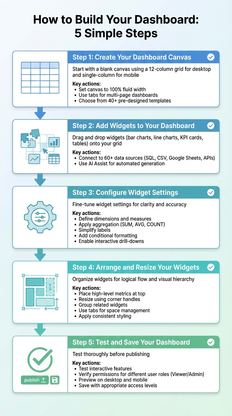
5-Step Process to Build Drag-and-Drop Dashboards Without Coding
With your platform and data set up, it's time to dive into building your dashboard. Thanks to drag-and-drop tools, this process is straightforward - even for beginners. You'll start with a blank canvas, add widgets, configure their settings, organize them logically, and test everything before going live. Once you master these steps, you can replicate them across various tools.
Step 1: Create Your Dashboard Canvas
Begin by selecting the option to create or edit a dashboard in your platform's interface. This opens a blank canvas, typically structured as a 12-column grid for desktop and a single-column layout for mobile. Some platforms even auto-adjust widget placement to optimize the layout. Before adding widgets, set your canvas to "100% fluid" so it stretches across the browser width. If you're designing a multi-page dashboard, consider using tabs like "Overview" or "Trends" to organize your data.
Not feeling creative? No problem. Many platforms offer over 40 pre-designed templates for tasks like sales tracking or marketing analytics. Once your canvas is ready, you're set to start adding widgets.
Step 2: Add Widgets to Your Dashboard
From the toolbar, choose the widgets you need - common options include bar charts, line charts, KPI cards, and tables. Drag and drop them onto your grid; the 12-column layout ensures everything stays aligned.
Next, connect each widget to its data source, whether that's SQL, CSV, Google Sheets, or an API. Advanced platforms support over 60 data sources, making it easy to populate your widgets. Some tools even feature an AI "Assist" tab, where you can type prompts like "Build a revenue dashboard with KPI cards", and the system will generate everything for you.
| Widget Type | Best Use Case |
|---|---|
| Number/KPI Card | Highlight critical metrics like revenue or orders |
| Bar Chart | Compare categories or values |
| Line Chart | Show trends over time |
| Scatter Plot | Find relationships between two variables |
| Heatmap | Display data density across categories or time |
| Funnel Chart | Track progression through stages (e.g., sales) |
Step 3: Configure Widget Settings
After connecting widgets to data, fine-tune their settings for clarity. Define dimensions (e.g., product type or region) and measures (e.g., revenue or quantity), then apply aggregation methods like SUM, AVG, or COUNT. For instance, to track monthly sales, set "Month" as the dimension and "Revenue" as the measure with a SUM aggregation.
Simplify labels to make the dashboard accessible to everyone - use "Total Sales" instead of "sum_revenue_usd". Adjust colors to match your brand or emphasize key data. Conditional formatting is another handy tool; for example, you can make a KPI card turn red when expenses exceed the budget. For pie charts, stick to six slices or fewer to keep things readable.
Want to go a step further? Add interactive features like event handlers. These allow users to click a data point in one widget and filter related data in others, creating a seamless drill-down experience.
Step 4: Arrange and Resize Your Widgets
With widgets configured, arrange them to create a logical flow. Place high-level metrics like Total Revenue or Churn Rate at the top for quick visibility. Below that, include detailed charts and tables to provide context.
Resize widgets using corner handles to prioritize important data or expand charts that need extra detail. The grid ensures everything stays aligned. Group related widgets together - for example, keep marketing metrics in one section and financial metrics in another - to make navigation easier. If space becomes an issue, use tabs to separate data instead of overloading a single page.
Keep the design clean by using consistent fonts, colors, and spacing. Some platforms even let you select multiple widgets to apply bulk styling for a uniform look. Be mindful that some widgets may have resizing limitations, like only allowing horizontal adjustments based on data type.
Step 5: Test and Save Your Dashboard
Before publishing, thoroughly test all interactive features to ensure accuracy. Log in under different user roles - like "Viewer" and "Admin" - to confirm that permissions are set correctly and sensitive data is protected.
Preview your dashboard on both desktop and mobile devices to check that everything displays properly. For mobile, ensure the single-column layout is clear and avoids horizontal scrolling. Once you're satisfied, save or publish your dashboard. Most platforms let you share it with varying access levels, such as "View-only" for analysts, "Edit-specific" for operators, and "Full control" for admins.
Tips for Creating Better Dashboards
Once you've built your dashboard, the next step is making it as effective and user-friendly as possible. A cluttered or slow dashboard can quickly lose its value. With a few thoughtful tweaks, you can turn disorganization into clarity and ensure smooth performance. Here are some practical tips to get the most out of your drag-and-drop dashboard.
Design Layouts That Are Easy to Read
Place your most important information in the top-left corner - this is where people naturally look first in left-to-right reading cultures. Limit the display to seven or fewer KPIs per screen to avoid overwhelming users. A study of 100 dashboards revealed that 58% included unnecessary visuals, while 53% lacked clear labels or context, making them harder to interpret.
Organize related widgets using whitespace to separate groups, and consider breaking up crowded dashboards into tabs for categories like Sales or Marketing. Maintain consistency in fonts, colors, and layouts across widgets to make the data easier to absorb. Since about 55% of business intelligence users access dashboards on mobile devices, optimize for smaller screens by stacking content vertically and using larger, touch-friendly elements.
Match Widgets to Your Data Needs
Choosing the right chart type is critical. Surprisingly, 42% of dashboards use visuals that don't suit their data. Here's a quick rundown of when to use specific widgets:
- Line Charts: Best for showing trends over time. They're great for spotting patterns but can become cluttered if too many lines are added.
- Bar Charts: Ideal for comparing categories. They make distinct values easy to evaluate but aren't suitable for continuous data.
- KPI Tiles: Perfect for high-level summaries. They provide quick insights but may lack detailed context.
- Pie Charts: Useful for simple part-to-whole comparisons, but avoid using them with more than five slices, as they become hard to read.
- Tables: Great for displaying detailed data. While they present raw values clearly, they can overwhelm users if not designed carefully.
| Widget Type | Best Use Case | Pros | Cons |
|---|---|---|---|
| Line Charts | Trends over time | Excellent for pattern recognition | Can become messy with too many lines |
| Bar Charts | Comparing categories | Easy to compare distinct values | Not ideal for showing continuous trends |
| KPI Tiles | High-level summaries | Immediate impact; easy to scan | Lacks granular detail or context |
| Pie Charts | Part-to-whole (limited) | Intuitive for simple compositions | Inaccurate with >5 segments |
| Tables | Detailed data display | Provides full information | Can easily overwhelm users |
Always include clear labels, units (like USD or %), and time frames (e.g., Q3 vs. Target) so users can quickly understand the data. Use consistent color schemes - if Revenue is blue in one chart, keep it blue across the dashboard.
Keep Your Dashboard Running Smoothly
A visually appealing dashboard won't matter if it lags or loads outdated data. To ensure smooth performance, avoid linking widgets directly to large raw datasets. Instead, use summarized or aggregated views to speed up loading times. For dashboards pulling massive datasets, pre-compute data or enable caching during off-peak hours to make the experience faster for users.
Set up automated refresh schedules to update data at regular intervals, whether hourly, daily, or as needed, so you’re always working with current information. Test your dashboard on both desktop and mobile platforms to confirm it performs well even on slower networks. Adding a "last refreshed" timestamp is a simple but effective way to keep users informed about data recency. Considering that 97% of collected data often goes unanalyzed, a well-optimized dashboard ensures you're making the most of your data.
Conclusion
Creating dashboards with drag-and-drop widgets has never been easier. With the ability to connect data sources, pick the right visualizations, arrange them on a canvas, and publish - all without writing a single line of code - this process is accessible to just about anyone. The key steps are straightforward: define your goals, choose widgets that align with your data, and organize the layout for maximum clarity and usability.
Low-code and no-code platforms are changing the game, making it possible for non-technical users to design professional dashboards. In fact, organizations using BI dashboards are five times more likely to make quicker decisions, according to industry trends. The cost advantage is just as compelling, with no-code solutions cutting development expenses compared to traditional methods. These tools are leveling the playing field, enabling more people to turn data into meaningful insights.
For those looking to explore options, the Best Low Code & No Code Platforms Directory (https://lowcodenocode.org) is a valuable resource. It compares top platforms across analytics, automation, and development, helping users find tools tailored to their needs - whether it's tracking marketing campaigns or monitoring team productivity.
Modern platforms go even further, incorporating AI features that simplify the process. From generating charts based on natural language queries to recommending the best visualizations, these tools make building dashboards faster and more intuitive. With these advancements, transforming raw data into actionable insights is more accessible than ever.
FAQs
How do I pick the right data sources for each KPI?
To align with your KPIs and business goals, it's crucial to choose data sources that are relevant, accurate, and up-to-date. You might pull data from internal databases, CRM systems, spreadsheets, or operational reports.
Using multiple trusted sources can give you a more comprehensive perspective. However, consistency is key - ensure your data is regularly updated and managed by dedicated teams to maintain its reliability and usefulness.
How can I make a drag-and-drop dashboard load faster?
To make a drag-and-drop dashboard faster, focus on optimizing both the data sources and the design. Start by using data extracts instead of live connections - this helps cut down on load times. Additionally, filter the data directly at the source to reduce the amount of processing required.
On the design side, keep things simple. Avoid using overly complex calculations, working with massive datasets, or adding too many widgets. By streamlining these elements, you can noticeably boost the dashboard's performance and make it more responsive.
What’s the safest way to share a dashboard with different roles?
The safest way to share a dashboard with various users is through role-based access control (RBAC). This method lets you assign specific permissions to individuals or groups, ensuring they can only view or modify content that aligns with their responsibilities. RBAC safeguards sensitive information, blocks unauthorized access, and ensures users only engage with content that's relevant to their role.