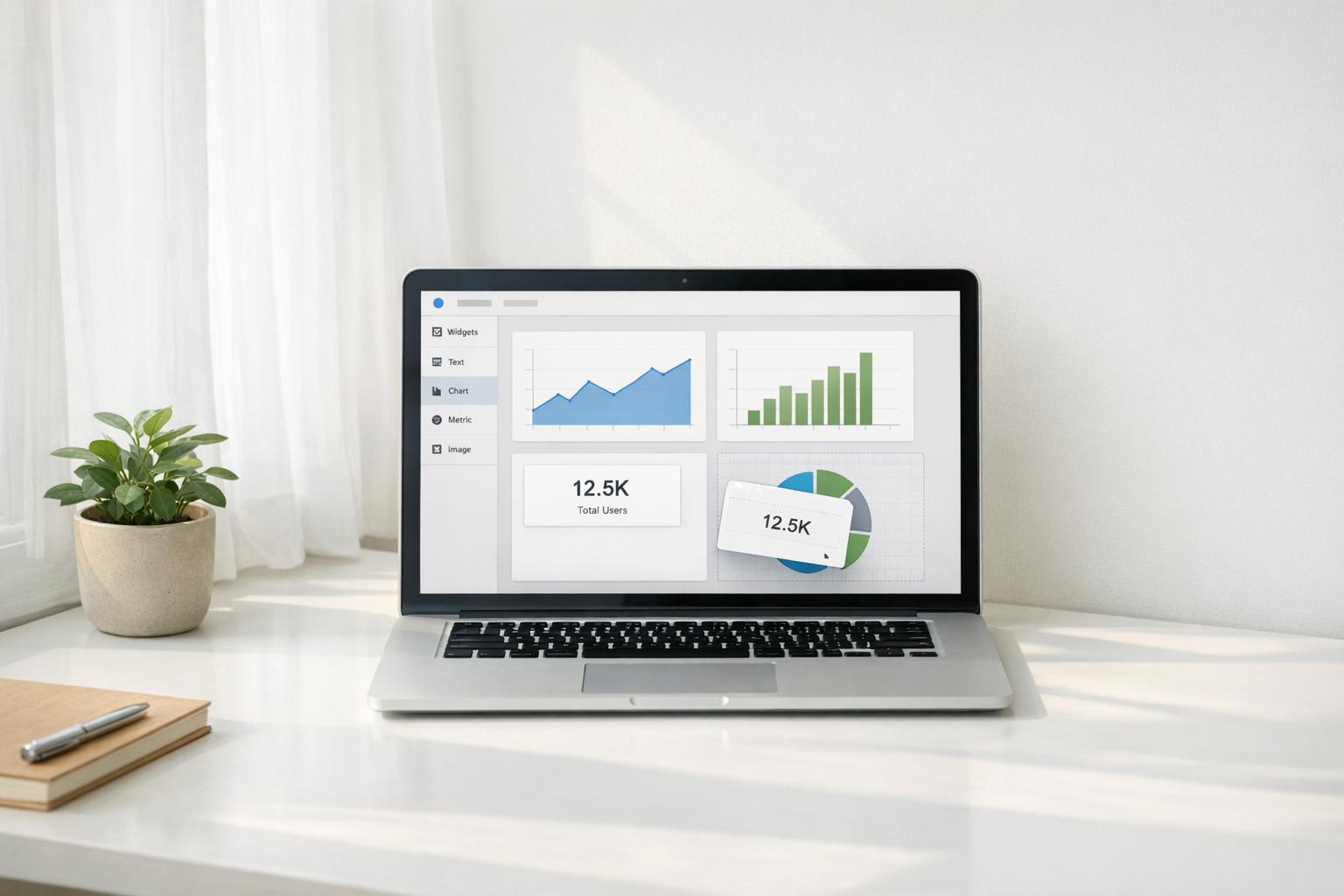
Prebuilt analytics templates in low-code platforms allow users to create dashboards quickly and without extensive coding. These templates come with pre-designed layouts, visualizations, and KPIs, making it easy to connect data sources like Google Sheets, SQL databases, or CRMs. Instead of spending weeks building dashboards, you can transform raw data into actionable insights in minutes.
Key Benefits:
- Save time with drag-and-drop tools and top no-code tools for data connection.
- Reduce dependency on IT or developers.
- Access ready-made KPIs (e.g., revenue, order count) and charts (line, bar, tables).
- Ensure security with built-in protocols like SOC II compliance.
- Improve collaboration, with 71% of enterprises reporting faster development.
When to Use:
- For tasks like sales tracking, marketing ROI, or inventory monitoring.
- When quick deployment or standardized reporting is needed.
- Not ideal for highly customized data models.
How to Choose the Right Template:
- Identify your business question (e.g., revenue growth or churn reduction).
- Ensure compatibility with your data sources (e.g., Salesforce, BigQuery).
- Look for features like role-based access, mobile optimization, and automated alerts.
Steps to Get Started:
- Choose a template based on your goals.
- Connect data sources using prebuilt connectors.
- Map data fields to template placeholders.
- Customize visualizations, KPIs, and layout.
- Automate reports and alerts for ongoing insights.
Prebuilt templates simplify analytics, making data visualization accessible to non-technical users while saving time and reducing costs.
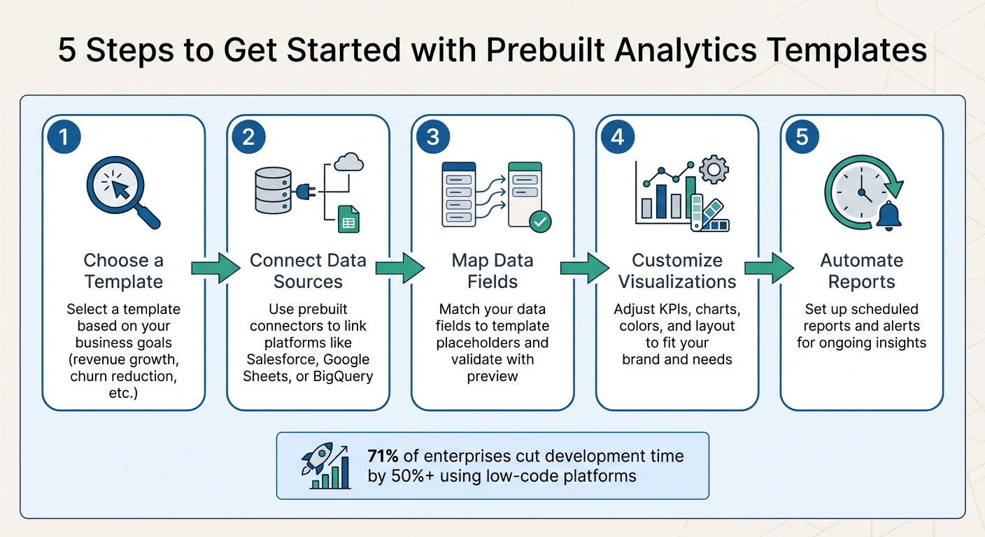
5 Steps to Get Started with Prebuilt Analytics Templates
Create stunning dashboards with Low-code/No-code Using Amazon QuickSight
sbb-itb-3a330bb
What Are Prebuilt Analytics Templates?
Prebuilt analytics templates are essentially ready-made blueprints that combine key data structures, visualizations, and KPIs into an easy-to-use format. They’re designed for low-code platforms, where users can simply drag and drop preconfigured components to create analytics solutions using no-code and low-code tools. Behind the scenes, these templates generate code that aligns with industry standards for security and performance.
These templates come with preconfigured KPIs - such as total revenue, order count, and average order value - alongside a variety of visualizations like line charts, bar charts, and interactive tables. They also include preset data models tailored for common business needs, such as customer databases, product catalogs, or inventory trackers. This eliminates the need to build data models from scratch, saving time and effort.
Unlike custom dashboards, which offer complete control but require significant development time and coding expertise, prebuilt templates provide a faster solution. While they might not offer the same level of flexibility, they enable rapid deployment. As Convertigo puts it:
"Pre-built templates act as foundational blueprints that encapsulate essential functionalities and design elements, allowing developers to bypass repetitive coding tasks".
Modern templates often integrate with APIs for ERP and CRM systems and include built-in security protocols, such as SOC II compliance. In fact, 71% of enterprises using low-code or no-code platforms reported cutting application development time by at least 50% compared to traditional methods.
These templates not only speed up deployment but also introduce several other advantages, which we’ll explore below.
Benefits of Using Prebuilt Templates
One major advantage of prebuilt templates is their ability to democratize data access. Teams across HR, marketing, and finance can create their own analytics tools without needing extensive IT knowledge. For example, organizations with active citizen developer programs saw a 38% boost in cross-functional collaboration and a 29% improvement in business process innovation. In large enterprises, the number of citizen developers was expected to outnumber professional developers by a factor of four by 2023.
Another key benefit is that these templates incorporate established best practices. They are built using proven frameworks, ensuring dashboards meet recognized standards for data visualization and user experience.
When to Use Prebuilt Templates
Knowing when to use these templates is essential to make the most of their benefits.
Prebuilt templates shine in scenarios where standardization is key. For instance, sales teams can use them to monitor win rates, forecast accuracy, and deal velocity by connecting to CRMs like Salesforce or HubSpot. Marketing teams often rely on templates to track metrics like cost per lead, campaign ROI, and funnel conversion rates using data from marketing and finance platforms.
Customer success teams benefit from templates for tasks like churn analysis, health scores, and NPS trends, pulling data from support systems and product usage analytics. Operational teams use them to monitor inventory turnover and fulfillment times via ERP and inventory system integrations.
Templates are particularly useful for tasks requiring quick turnarounds, such as monthly financial reports or quarterly business reviews. They’re also a great starting point for testing ideas. For example, a no-code template can help validate a concept before transitioning to more complex low-code scripting as the project evolves.
That said, templates aren’t always the right fit. They may fall short in cases requiring highly customized data models or unique analytical approaches. To ensure success, it’s important to first define the business problem and evaluate whether the template’s architecture can handle the necessary data loads and functionality.
How to Choose the Right Template
When selecting a template, start by identifying the specific business question you're trying to answer. Whether it's tracking revenue growth, improving efficiency, or reducing customer churn, this clarity will help you avoid templates cluttered with irrelevant metrics. From there, focus on the features that make a template a good fit for your needs.
Assessing Template Features
The first thing to check is whether the template integrates seamlessly with your existing data sources. It should connect directly to platforms like Google Sheets, Airtable, HubSpot, or Salesforce without requiring custom coding. For example, Google's template gallery offers options tailored for BigQuery, Google Ads, and YouTube Analytics, each designed to work smoothly with those specific data sets.
Look for templates with interactive features such as dropdown filters and drill-downs, which allow for deeper data exploration. Some modern templates even include AI-powered tools like natural language querying, enabling you to ask questions in plain English, and automated data preparation to handle formatting tasks for you.
If you're part of a larger organization, role-based access control becomes essential. This feature lets you assign permissions so that different teams can only view data relevant to their roles - for example, marketing can access campaign metrics while finance focuses on revenue data. Additionally, make sure the template is mobile-friendly, as more than half of BI users (around 55%) access dashboards on mobile devices.
Another useful feature is automated alerting, which notifies you when key performance indicators (KPIs) hit specific thresholds. Templates with no-code connection options can save you a lot of time compared to traditional coding methods.
By focusing on these criteria, you can find a prebuilt template that quickly turns raw data into actionable insights, especially when using low-code development platforms.
Aligning Templates with Business Goals
It's important to align your template choice with its intended use. Templates generally fall into three main categories:
- Dashboard/Boardroom: Designed for real-time monitoring of high-level metrics.
- Report: Ideal for detailed analysis, often including annotations and tables.
- Presentation: Perfect for slide-deck-style sharing with stakeholders.
This categorization helps ensure that the template meets your team's specific needs. For instance, a sales team tracking daily pipeline velocity will require a different setup than a finance team preparing quarterly board reports.
To keep your dashboard focused, stick to seven key KPIs, following the Rule of Seven. Studies show that 58% of dashboards include unnecessary visuals that create clutter, while 53% lack clear labels or context, such as units or timeframes. Templates that place critical KPIs in the top-left corner - the area where users naturally look first - can improve clarity and usability.
Before finalizing your choice, test the template in preview mode (like appending /preview in Looker Studio) to confirm it works correctly with your data. As Anly.ai puts it:
"Purpose driven design ensures your dashboard stays actionable and not overloaded with noise".
Connecting Data Sources to Templates
Once you've picked the right template, the next step is linking it to your data sources to bring in dynamic insights. This process generally involves two key stages: first, you connect the platform to your databases or APIs (referred to as "Dashboard Data Source Selection"), and then, you define specific queries for each chart or table (known as the "Element Data Source"). Most platforms kick this off with an authentication step, where you provide credentials to grant access to your data sources.
Modern tools have simplified this process significantly. Take Retool as an example - in a 2025 tutorial, they demonstrated connecting a PostgreSQL database by importing two CSV files (orders.csv with 150 orders and categories.csv). Using an AI prompt, the platform automatically generated SQL queries and mapped these data sources to KPI cards displaying "Total Revenue" and "Average Order Value" within a 12-column grid layout. To enable this kind of automation, you need to connect your data source first so the AI can understand your schema and generate accurate queries. Some platforms even offer a "Use report template for new reports" checkbox during setup, which populates a prebuilt layout with your connected data, saving time compared to manual configuration.
Now, let’s dive into how prebuilt connectors make this process even easier.
Setting Up Prebuilt Connectors
Prebuilt connectors simplify integration by offering ready-made solutions for popular platforms, cutting out the need for custom coding. The setup process typically involves configuring credentials, selecting tables or properties, preparing data, and mapping fields to UI components. During this process, you'll likely provide OAuth credentials or API keys to authorize the tool to access data from sources like Google Analytics, Facebook Ads, or SQL databases.
In Looker Studio, you’ll encounter two kinds of data sources: embedded sources, which stay within a specific report and move with it when copied, and reusable sources, which are created from the home page and can be applied across multiple templates. If you copy a template and see an "orange dot" indicator, it means you only have view access to the default data source. Fixing this is straightforward - just replace it with a reusable data source where you have full permissions.
For more complex data, built-in tools for data preparation (ETL - Extract, Transform, Load) can help. Amy Groden from Alpha Software explains:
"Low code is designed to work with transactional data in fixed record lengths".
If your data is unstructured, solutions like Salesforce CRM Analytics offer "Recipes" to parse and normalize data before mapping it to your template visuals. During setup, you’ll also need to decide if your template requires near real-time data or daily batch updates - this choice impacts both performance and the timeliness of your insights.
Mapping Your Data Fields
After connecting your data sources, the next step is mapping them to the template’s predefined structure. Each platform has its own terminology for this process: Slideform uses "pragmas" (e.g., {{client_name}}), Flourish refers to "column bindings", and UnifyApps calls them "data pills". The objective is the same - linking your data to the correct placeholders in the template.
Start by identifying each template placeholder and matching it with the appropriate data field. In Slideform, for example, you can use the "Preset a Value" option to make these connections. Some platforms also offer automatic column mapping, which analyzes your uploaded data and selects the most suitable columns, reducing manual effort.
If a metric isn’t available, you can create it using a simple formula, such as {{monthly_rate}} * 12. Always use the preview function after mapping to ensure that data is displayed correctly before finalizing the report. This step helps catch issues like slow-loading filtered data or incorrect mappings.
Here’s a practical tip: give your datasets clear, descriptive names during the connection phase. This avoids confusion when mapping fields across multiple template components. Additionally, cross-check a few values from your connected source against a trusted manual report to ensure accuracy. Proper mapping ensures that every KPI reflects real-world performance, which is crucial for maintaining the effectiveness of your reports. With around 80% of teams conducting multisource analysis, getting these connections right is essential for dependable insights.
Once your data fields are mapped correctly, you’re all set to customize and fine-tune your template for deeper insights.
Customizing Templates to Fit Your Needs
Once your data is connected, the next step is to tailor the template to align with your specific business goals. This process builds on the initial setup, allowing you to fine-tune your dashboard for better insights and usability.
Modifying Visualizations and KPIs
Adjusting visual elements can make a world of difference. You can change chart types, tweak color schemes, or rearrange the dashboard layout by resizing and moving widgets to emphasize key metrics. Many platforms even offer one-click theme changes to switch between Light and Dark modes or apply your brand’s colors across the dashboard.
If you're using a tool like Looker, the Chart Config Editor lets you customize visualizations using HighCharts JSON code. This allows you to modify everything from background colors to tooltip styles and axis formatting. For those without coding experience, AI-driven tools like Gemini or Bricks AI can translate plain language instructions into the required code.
Another useful feature is conditional formatting, which adjusts visuals based on data thresholds. For example, you can set a KPI card to turn orange when a value exceeds a target. Looker users can also use series formatters to highlight data points above average with expressions like select: value > mean.
A great example of customization in action comes from Torigen Pharmaceuticals. In March 2026, CEO Ashley Kalinauskas shared how her company used Softr to create a custom portal for over 250 veterinary clinics. This system processes over 600 monthly submissions and saves at least one employee 3 to 4 hours of manual work daily. She remarked:
"We're not coders or developers, but Softr is so easy to use and learn - it lets us run with our ideas".
When refining KPIs, ensure they reflect strategic goals rather than routine operations. Break down each KPI into clear components: the metric name (e.g., "Sales"), the desired outcome ("Increase"), and the target timeline ("+15% within 1 year"). For metrics that use different units, like dollars and hours, normalize them to a common scale using a baseline and target to calculate performance percentages.
Preserving Template Performance
Customizing your dashboard is exciting, but it’s equally important to maintain its speed and accuracy.
For Looker users applying JSON overrides, avoid changing default settings after implementing custom code, as this can result in blank visualizations. If updates are necessary, clear the overrides first, make your changes, and then reapply the JSON.
During testing, instead of deleting elements, use "masking" or "eye" icons to temporarily hide layers. This way, you can experiment without losing your previous work. Also, lock dimension settings for time-based elements or specific chart components to ensure they remain properly sized, even when users resize their browser windows.
Keep your data current by setting up automated refresh schedules and configuring alerts for any pipeline failures. Document all changes in a log to simplify future updates. Finally, implement Row-Level Security (RLS) to restrict data visibility based on user roles, ensuring both performance and privacy.
Here’s a quick overview of customization methods across different technical environments: (many of which are featured in top low code platform reports)
| Customization Method | Technical Level | Key Capabilities |
|---|---|---|
| Theme Selection | No-Code | Modify colors, backgrounds, and fonts across the entire dashboard |
| Block Editing | No-Code | Drag-and-drop resizing, repositioning, and renaming of chart titles |
| Layer Editor | Low-Code | Add icons, text, and HTML; apply conditional visibility |
| JSON Override | Low-Code/Pro-Code | Advanced customization of tooltips, axis styles, and HighCharts API features |
| AI Prompting | No-Code | Generate layouts or JSON code using natural language commands |
Managing and Improving Template Performance
Once you've customized your templates, the next step is ensuring they perform well and stay useful over time. This involves setting up automated processes and continuously evaluating how effectively the templates meet your goals.
Setting Up Automated Reports
Dashboards become far more effective when they deliver insights automatically. For example, you can set up threshold-based alerts for Cards, KPIs, or Gauges to notify you when data crosses a critical point - like sales dropping below a target. Use clear and specific titles such as "CRITICAL: Daily Sessions Below 5k" so recipients immediately understand the situation's urgency.
Most low-code platforms offer scheduled reporting features, which can email dashboard updates to stakeholders on a regular basis - whether daily, weekly, or monthly. To ensure these reports remain accurate, sync them with your data refresh schedule, as alerts typically trigger only after a successful data update. To avoid overwhelming users with notifications, set limits like "no more than once every 24 hours".
For broader team collaboration, you can integrate your templates with workflow automation tools like Power Automate, Zapier, Make, or N8N. These tools can push insights directly into platforms like Microsoft Teams or Slack, turning static dashboards into active communication channels. In Power BI, remember that visuals must be pinned to a dashboard before you can manage alerts.
Once this automation is in place, focus on how these insights lead to real business actions.
Measuring Template Effectiveness
To gauge how well your templates are working, tie their performance to specific business outcomes. For instance, track metrics like monthly revenue growth, campaign ROI, or operational efficiency. The real test of a template's value is whether it inspires actions - such as reallocating a marketing budget or tweaking page metadata to improve visibility.
You can also monitor how users interact with your templates. Metrics like "Most Popular" or "Most Recently Used" can reveal which templates are most helpful. If users frequently modify a template using "Quick Edit" or "Save As", it might indicate the original version needs updating to better meet their needs.
Technical performance is another key factor. Keep an eye on chart load times and data refresh intervals. If a report fails, check your dataset's refresh history to identify the issue. As your business evolves or new data becomes available, adjust your templates accordingly - many no-code tools let you make these updates without needing IT support.
| Feature | Purpose for Automation | Tools Mentioned |
|---|---|---|
| Data Alerts | Notifies users when KPIs hit critical thresholds | Power BI, Softr, Anly.ai |
| Scheduled Reports | Automatically sends dashboard updates to stakeholders | Anly.ai, Softr, InstaCharts |
| Workflow Triggers | Initiates actions in other apps (e.g., task creation) | Power Automate, Zapier, Make, N8N |
| AI Insights | Enables natural language queries for instant pivots | Anly.ai, Softr |
Conclusion
Prebuilt analytics templates in low-code platforms make data visualization easier and more affordable by eliminating the need for custom development. As Bilyana Petrova from RevealBI explains:
"Dashboard templates serve as a powerful data analytics tool that streamlines the creation of new dashboards that provide key business insights and drive users' decision-making".
These templates can turn raw data into polished dashboards in just minutes, making analytics accessible to teams without specialized developers.
The benefits are clear: faster deployment, reduced development costs, and simplicity for non-technical users. Embedded analytics tools can cut dashboard creation time in half compared to traditional approaches. For small and medium businesses, templates are especially budget-friendly since development costs are shared across multiple users. Plus, they incorporate best practices to ensure metrics are presented clearly and consistently.
When choosing a platform, it’s important to find one that integrates seamlessly with your data sources and aligns with your business goals. Whether you rely on Google Ads, SQL databases, or cloud-based CRMs, the platform should support your data and deliver actionable insights. Templates provide a strong foundation, but you can still make them your own - customize visualizations, refine KPIs, and apply your branding to fit your needs.
If you’re unsure where to begin, the Best Low Code & No Code Platforms Directory is a helpful resource. It offers a detailed comparison of tools designed for analytics, automation, and visualization, featuring prebuilt templates and connectors tailored to different industries and use cases. This can help you find a solution that matches both your technical needs and your budget.
FAQs
How do I pick the right analytics template?
When picking an analytics template, think about your business goals and the kind of report or dashboard you’re aiming to create. Make sure the template works well with your data sources, like Google Analytics or BigQuery, and fits the style of visualization you want. Many platforms provide templates tailored for specific tasks, such as tracking performance or creating presentation-ready visuals. Choose one that suits both your purpose and the preferences of your audience.
What if my data fields don’t match the template?
If your data fields don't align with the template, you can adjust or map them to make everything fit. Many platforms let you tweak templates by editing fields, filters, or formatting to match your data structure. Another option is to swap out the data source for one that fits better. The key is ensuring compatibility by either preparing your data or tailoring the template to suit your needs.
How can I keep dashboards fast as I customize them?
To ensure dashboards in low-code platforms remain quick and responsive, start by optimizing your data sources and queries. Efficient data retrieval is key - minimizing load times by avoiding overly complex queries can make a big difference.
Make use of prebuilt templates. These templates are designed with performance in mind, helping you avoid unnecessary slowdowns. At the same time, be cautious about adding too many widgets or overly complicated elements to your dashboards. While customization is important, simplicity often leads to better performance.
By focusing on streamlined queries and thoughtful design choices, you can maintain dashboards that are both functional and fast.