Creating dashboards no longer requires coding skills or expensive developers. With no-code platforms, anyone can design functional dashboards using drag-and-drop tools and pre-built components. These dashboards provide real-time insights, helping teams make faster decisions without relying on static spreadsheets. Here's how you can get started:
- Choose a Platform: Pick a tool that integrates with your data sources (e.g., Google Sheets, SQL databases) and fits your needs, such as Softr, Zite, or Looker Studio.
- Define Goals: Decide what you want to track - whether it's sales metrics, marketing performance, or financial data - and keep the design focused on key insights.
- Connect Data: Link your data sources and clean up the information to ensure accuracy.
- Design the Dashboard: Use drag-and-drop interfaces to create charts, tables, and filters. Keep it simple and visually clear.
- Test and Deploy: Verify functionality, ensure role-based permissions, and publish your dashboard for users.
No-code tools make dashboard creation accessible and affordable, often costing less than $70/month. Whether you're a small business owner or part of a larger team, these platforms simplify the process, allowing you to focus on making data-driven decisions.
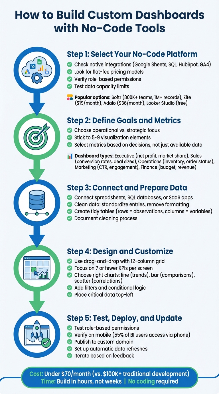
5-Step Process to Build No-Code Dashboards
How to Build a No Code Dashboard
sbb-itb-3a330bb
Step 1: Select Your No-Code Platform
Picking the right no-code platform is crucial for building a reliable and scalable dashboard. A poor choice can lead to issues with data integration and growth, while the right one simplifies development and adapts to your needs over time.
What to Look For in a Platform
Start by checking how the platform connects to your data sources. Look for tools offering native integrations with systems you already use, such as Google Sheets, HubSpot, SQL databases, or Google Analytics. These integrations should sync data in real-time without relying on middleware like Zapier, which can increase costs and add potential failure points. If you plan to share dashboards externally, a flat-fee pricing model is often better than per-user pricing, as it keeps costs predictable.
Another key factor is user access control. Platforms with role-based permissions allow different teams - like sales and finance - to access only the data they need. Also, verify the platform's capacity to handle your data volume. For example, Rows caps at 100,000 rows per table, while Softr supports over 1 million records. Testing these limits during free trials can prevent future headaches as your data grows.
Decide whether you prefer a canvas-based builder for precise layout control or a spreadsheet-style interface for a more familiar grid view. Many platforms now include AI-powered tools that can generate dashboards from simple text prompts like, "Show me last quarter's revenue by region".
With these features in mind, here’s a look at some popular no-code dashboard platforms.
Common No-Code Dashboard Platforms
Softr is a favorite among over 800,000 teams worldwide. It excels in connecting to multiple data sources through its drag-and-drop builder. It also supports over 1 million records and offers more than 15 native data integrations.
Ashley Kalinauskas, CEO of Torigen Pharmaceuticals, shared: "We're not coders or developers, but Softr is so easy to use and learn - it lets us run with our ideas".
Zite specializes in AI-driven dashboard creation. It can generate entire dashboards from natural language prompts, making it a solid choice for teams looking for simplicity. At $19/month with unlimited users, it’s ideal for broad dashboard sharing.
Adalo focuses on mobile-first dashboards, offering true iOS and Android apps with features like push notifications. This makes it perfect for teams needing real-time updates in the field. Plans start at $36/month with no record limits on paid tiers, and over 3 million apps have been built using Adalo.
For teams already working within Google’s ecosystem, Looker Studio is a free option with seamless integrations to tools like Google Ads, Sheets, and BigQuery. If you're tracking marketing metrics, Databox is another strong contender, offering over 130 native marketing integrations and goal-tracking features at a similar price point.
For a deeper dive, check out the Best Low Code & No Code Platforms Directory (https://lowcodenocode.org). It provides detailed comparisons to help you find the right tool for your specific needs, whether it’s analytics, automation, or app building.
Marc Walford, Head of FinOps at ITV, built a dashboard for 40+ teams to monitor cloud spending. He explained, "I try to make the interface as clean as possible for when you first log in. It's completely organized for getting the most relevant data to you quickly without any clicking and searching".
Step 2: Define Your Dashboard Goals and Metrics
Before diving into the design phase, it's crucial to define your dashboard's purpose and the key metrics it will display. Without clear objectives, you risk ending up with a cluttered, confusing interface that doesn't serve its intended purpose.
Set Your Dashboard Objectives
Determine whether your dashboard will handle operational tasks (like tracking inventory, order statuses, or support queues) or focus on strategic insights (such as net profit trends or market share). This distinction is essential - over 70% of executives cite real-time data quality and technology gaps as hurdles in making informed decisions.
Your goal is to simplify complex data into actionable formats that allow for quick decision-making. For instance, if you're monitoring cloud spending across departments, your objective might be to help each team spot budget overages immediately. Keep the design focused - stick to 5 to 9 visualization elements to maintain clarity and usability.
Once you've nailed down the objectives, select metrics that directly inform those decisions.
Choose Your Key Metrics
Pick metrics based on the decisions they support, not just the data you have at your disposal.
Matt David from DataSchool explains it best: "The point of a dashboard is to help people make better decisions by giving them information and context".
Metrics should align with your audience's needs. Here’s a quick guide:
| Dashboard Type | Audience | Example Metrics |
|---|---|---|
| Executive | CEOs / CXOs | Net profit, market share, revenue trends |
| Sales | Sales Teams | Conversion rates, deal sizes, days to close |
| Operations | Managers / Staff | Inventory levels, order statuses, supply chain stats |
| Marketing | Marketing Teams | Click-through rates, social engagement, ad spend |
| Finance | Finance Teams | Budget spending, projected expenses, revenue |
To refine your metrics, talk directly with stakeholders to understand their decision-making challenges. Use a metric spreadsheet to document how each metric is calculated, how it should be grouped (e.g., by timeframe or category), and what filters are needed. Match your visualizations to the type of data: bar charts for group comparisons, line charts for trends, and scatter plots for numerical relationships.
Plan Different User Views
Different roles require different data. Your sales team doesn't need the same metrics as your CFO, and external clients shouldn't see internal operational details. Use role-based permissions to customize dashboard views.
In July 2024, Marc Walford, Head of FinOps at ITV, created a dashboard for over 40 teams to monitor cloud spending. Each team lead could only view their department's data, displayed through bar graphs highlighting spending overages. Visibility conditions ensured teams couldn't accidentally see each other's budgets.
Similarly, in January 2023, Segment used a Stacker-based dashboard to manage a program for over 15,000 startups. Granular permissions ensured that each startup could only access data relevant to their own progress.
Organize dashboards with tabs or sections for better navigation. For example, an "Overview" tab can display high-level KPIs, while a "Details" tab can dive into granular transaction data. Include filters to let users drill down by region, department, or time period.
Joyce Kettering, DevRel at WeWeb, emphasizes: "Gating content in the frontend is more of a UX feature than a security measure. In web development, security always happens in the backend".
Make sure backend security enforces these restrictions to safeguard sensitive data, rather than relying solely on the visual interface.
Step 3: Connect and Prepare Your Data
After setting clear goals for your dashboard, the next step is to connect your data sources and get them ready for visualization. This step is critical because it ensures your dashboard delivers accurate and actionable insights. Without proper data preparation, you risk working with unreliable or incomplete information.
Available Data Source Options
No-code platforms offer a wide range of data source integrations. You can connect to spreadsheets like Google Sheets, Airtable, or Microsoft Excel (via OneDrive or SharePoint) with two-way synchronization. For larger datasets, platforms often support SQL databases and data warehouses such as PostgreSQL, MySQL, BigQuery, and Snowflake.
Many tools also integrate seamlessly with SaaS applications like HubSpot, Salesforce, Stripe, GA4, Facebook Ads, and Google Ads. For non-native sources, REST or GraphQL APIs are often available. If you're dealing with unstructured data, modern AI-powered tools can even extract clean tables from PDFs or invoices.
Chris Tweten, CMO at Spacebar Collective, shares: "With Rows, our reports are automated and much more detailed. We no longer need to copy and paste data from GSC or GA4. Instead, we can easily adjust the data source for specific months or periods, and the reports update automatically".
You can either use an all-in-one platform like Rows, which handles data storage, logic, and visualization in one place, or create a custom stack of no-code tools. For example, you might use Airtable for data storage, Zapier for automation, and Softr for the user interface. Once your tools are connected, you'll map fields from your data source to specific dashboard elements, such as linking a "Revenue" column to a bar chart.
How to Prepare Your Data
Connecting your data is just the first step - cleaning and organizing it is equally important to ensure your dashboard provides clear insights.
Start by cleaning your raw data. Create a tidy table where each row represents an observation and each column represents a variable.
Statistician Hadley Wickham famously said: "Like families, tidy datasets are all alike but every messy dataset is messy in its own way".
Organize your data into measures (like sums or averages for calculations) and dimensions (categories for filtering or grouping). Standardize your entries to avoid inconsistencies - e.g., ensuring "USA" and "United States" are treated as the same category. Each cell should contain only one value, and you should remove any grid formatting, color coding, or summary rows like totals or averages, as these can interfere with analysis tools.
Use functions like PROPER(), VALUE(), TRIM(), and CONCATENATE() to clean and merge data fields. For missing values, functions like IF() and ISBLANK() can help fill in gaps or replace empty cells with "0" for calculations. To simplify granular data, such as grouping specific ages into "Age Ranges", use SWITCH() or nested IF() functions.
Avoid using pre-aggregated data. For example, a table showing "Total Sales 2023" won’t let you filter by month or region. Instead, keep your data granular to allow for flexible analysis. Document your entire cleaning process in a separate sheet, including all steps, lookup tables, and source links. This ensures the process can be repeated whenever you update the data.
Step 4: Design and Customize Your Dashboard
Once your data is connected and cleaned, it’s time to create a dashboard that’s both functional and visually appealing. This step transforms raw data into an interactive, user-friendly interface.
Arrange Elements with Drag-and-Drop
Most no-code platforms offer a drag-and-drop interface, making it easy to organize elements like charts, tables, and buttons. These platforms often use a 12-column grid system, which helps keep everything aligned by snapping components into place automatically. If you remove or reposition a widget, features like "upwards gravity" automatically adjust other elements to fill the empty space.
To move a widget, grab it by its center and drag it to the desired spot. To resize, hover over the lower-right or right edge until the resize cursor appears, then click and drag. While most widgets are flexible, some may have specific resizing rules - for instance, certain data types might only allow horizontal adjustments. Dashboards also adapt to different screen sizes, shifting from a 12-column layout on desktops to a single-column view on mobile devices.
For efficiency, use the "Duplicate" option to copy and tweak existing widgets instead of starting from scratch. Add markdown tiles to display text headers, logos, or notes that explain the data to users. To maximize space, hide unnecessary tile headers on specific widgets, keeping the focus on the content.
Customize Widgets and Charts
Choosing the right visualizations is key to making your data easy to understand. Use line charts for trends over time, bar charts for comparisons or rankings, and scatter plots to highlight correlations. If you’re using pie or doughnut charts, limit them to five or six slices to avoid clutter.
Keep your dashboard streamlined by focusing on seven or fewer KPIs per screen. This prevents information overload and allows users to quickly spot key trends. Place the most critical data in the top-left corner, as it’s the first area users typically look at. Stick to consistent fonts, colors, and layouts to maintain clarity.
Each widget should provide clear insights. For example, add reference lines to charts to indicate targets or thresholds, and include tooltips that reveal more details when users hover over data points. Always display a "last updated" timestamp so users know how current the data is. To ensure accessibility, use high-contrast color schemes - this is especially important since about 8% of men experience color vision deficiencies.
In a study of 100 dashboards, 58% included unnecessary visuals that created clutter, while 53% lacked clear labels or context. Avoid using technical jargon in titles or axes; opt for simple, straightforward language instead. Aligning visual elements with the most important metrics ensures your dashboard remains focused on helping users make decisions.
Add Filters and Conditional Logic
Filters allow users to dive deeper into the data without overwhelming the main view. No-code platforms typically offer various filter types, such as dropdown menus for extensive lists, button groups for smaller sets (up to 30 options), checkboxes for multiple selections, and range sliders for numerical or date-based filtering.
You can create cascading filters, where a parent filter (like "State") narrows the options available in a child filter (like "City"). For large datasets, enabling "Require a filter value" prevents the dashboard from loading until a filter is applied. This helps improve performance and avoids overwhelming users with too much data at once. Place commonly used filters in the top bar for easy access, while secondary filters can go into "Popovers" or "More" menus to keep the interface tidy.
Advanced platforms also offer conditional logic, which tailors the dashboard to individual users based on their roles or permissions. For example, you can set up alerts that send notifications or messages when a specific metric hits a target. Some tools even let users input new values - like adjusting budgets - and see real-time updates reflected in charts and forecasts.
You can fine-tune which widgets respond to each filter, ensuring that filters only apply where relevant. Enabling cross-filtering allows users to click on a data point in one chart and automatically filter related charts across the dashboard. This creates a more interactive and intuitive experience.
Step 5: Test, Deploy, and Update
Test Your Dashboard
Once you've designed and customized your dashboard, the next step is thorough testing to ensure it works as intended. Start by verifying role-based permissions. Log in as different user roles to confirm that each group only has access to the data they are supposed to see. Test every interactive feature, such as clicking on chart data points or using drill-down modals, to confirm they function correctly. Additionally, check how the dashboard looks and performs across various devices, especially mobile, since around 55% of BI users access data on their phones. Even though most platforms automatically adjust layouts - like switching from a 12-column desktop view to a single-column mobile format - ensure that charts, filters, and other elements remain clear and usable.
Pay close attention to the accuracy of data queries. Make sure filters, such as date ranges or regions, are returning the correct results. It's also a good idea to manually review AI-generated SQL queries and bindings to catch any errors. Once you're confident everything functions perfectly, you're ready to move on to deployment.
Publish to a Custom Domain
After testing, it's time to make your dashboard available to users. Tools like Adalo and WeWeb simplify the technical aspects of deployment, such as handling SSL certificates or provisioning profiles, whether you're publishing to a custom URL or releasing a mobile app. For internal use, many platforms allow you to embed dashboards directly into tools like Notion, Confluence, or Slack.
Consider rolling out features gradually. This phased approach allows you to gather feedback and tweak the dashboard before a full-scale launch. Assign someone to assist users during onboarding and another person to collect ongoing feedback and share update notifications. Once deployed, keep an open line of communication with users to refine and improve the dashboard based on their experiences.
Update as Needs Change
Dashboards need to evolve as your business requirements shift. Set up automatic data refreshes - whether hourly, daily, or based on specific triggers like SCHEDULE() - to ensure the information stays current. Many modern platforms now include AI-driven tools for maintenance, letting you make updates by simply typing commands like "Add a filter for category" or "Move the charts to the top".
Use permission groups to control who can edit the dashboard's structure versus those who can only view the data. For more complex setups, maintain separate environments for development, staging, and production. This allows you to test updates thoroughly before rolling them out to all users. By staying proactive with updates, you ensure your dashboard remains relevant and effective over time.
Conclusion
Creating custom dashboards with no-code tools is no longer a task limited to developers or data specialists. By following the steps outlined - choosing the right platform, setting clear objectives, connecting your data, designing an easy-to-use interface, and keeping everything up to date - anyone, from marketers to business owners, can build professional dashboards in just a few hours. Compare this to traditional development, which can cost over $100,000, while most no-code options are available for under $70 per month.
The process not only speeds up dashboard creation but also gives users more control. The biggest benefit? Moving from manual data exports to automated, live dashboards that enable quicker, data-driven decisions. This shift changes how teams interact with and act on information in real time.
Today’s no-code platforms go far beyond simple drag-and-drop tools. Many now include AI-powered features that clean data, create charts from natural language inputs, and even predict trends - all without needing SQL expertise. Plus, cross-platform deployment is often built in, so your dashboard works seamlessly on both web and mobile, complete with push notifications.
Starting small and iterating is essential. Pre-made templates can save time, while focusing on your audience helps ensure the most important metrics are front and center. Clean data is critical - connecting messy sources can lead to confusion. A clear, user-friendly interface ensures quick access to relevant insights without unnecessary clicks or distractions. These principles form the backbone of the no-code dashboard creation process.
It’s worth experimenting with different platforms to find one that fits your specific needs. Whether you’re after a spreadsheet-like layout, mobile-friendly apps, or client-facing portals, there’s a no-code solution tailored for you. For a detailed comparison of tools across analytics, automation, and development, check out the Best Low Code & No Code Platforms Directory (https://lowcodenocode.org). It’s a great resource for finding the perfect platform to bring your dashboard vision to life.
FAQs
Which no-code dashboard tool should I pick for my data sources?
The best no-code dashboard tool really depends on what you're looking to achieve. Are you working with live data or need a simple drag-and-drop interface? Rows and Stacker are solid options for those needs. If you're dealing with more complex databases, tools like Embeddable or Retool might be a better fit. For those who want fast, AI-driven dashboards, Knack is a great choice. Ultimately, your decision should align with your data type and how much customization you require.
How do I keep my dashboard data accurate and secure?
To keep your dashboard data accurate and up-to-date, connect it to live data sources that refresh automatically, such as databases, spreadsheets, or APIs. Using no-code tools with real-time syncing can help eliminate outdated information and cut down on manual errors.
For security, set up proper access controls, like permissions and row-level security, to ensure data is only accessible to the right people. Opt for no-code platforms that emphasize data protection, and make sure to perform regular updates and monitor for vulnerabilities to keep your data safe.
How can I make my dashboard fast and mobile-friendly with big datasets?
When working with large datasets, creating dashboards that are both fast and mobile-friendly requires attention to detail. Start by focusing on efficient data processing - this means limiting the amount of data loaded at one time to avoid overwhelming the system. Pair this with responsive design, ensuring layouts adapt seamlessly to different screen sizes.
Keep visualizations lightweight to prevent performance bottlenecks. Avoid overly complex visuals that might slow things down, especially on mobile devices. Using no-code tools can make this process easier, as many come with real-time updates and mobile-optimized templates that streamline development while maintaining performance across various devices.